Acme Manufacturing Unveils New Logo and Branding
The new logo and branding are designed to symbolize Acme's modern focus.
#management
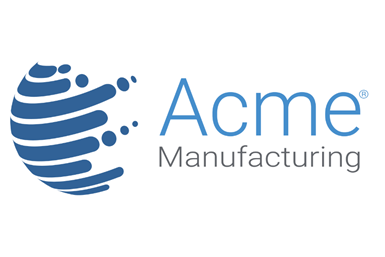
Acme Manufacturing (Auburn Hills, Mich.) has unveiled a new logo to symbolize its modern focus. The design aligns with the company’s role as an industry leader in innovation.
“The new logo and branding demonstrate our drive for continuing to innovate and bring modern, technology-focused solutions to our customers” said John McGrane, Acme’s Marketing Manager.
With the new logo, Acme states it wanted to preserve its legacy by retaining similar elements of its past designs. The globe shape stands out from the text, serving as a modern representation of Acme’s expanding global footprint. The clean “Roboto” font style aligns with the automation technology that Acme engineers. The tagline “Shaping the future since 1910” contains a clever double meaning; it references the company’s fourth generation of family ownership, along with the company’s specialty in shaping materials through grinding, polishing, buffing, and deburring.
During the past year, Acme made many internal process changes that led to increased efficiency and more innovative solutions. This forward motion instigated the need for a new logo and branding to reflect the focus on perpetual innovation in a global market.
Acme Manufacturing | www.acmemfg.com
RELATED CONTENT
-
How Artificial Intelligence Will Revolutionize Your Business
11 predictions of how AI and related technologies will revolutionize finishing in the next 10 years.
-
Managing Stacked Tolerances with PTFE Lubricants
PTFE coatings allow surgical instruments to overcome static friction.
-
Questions and Answers for Painting Anodized Aluminum
We paint parts made of anodized aluminum. Suddenly, we are having a problem with paint adhesion. Is this an adhesion problem? What are the pros and cons of painting anodized aluminum?


